


A guide to creating a user-friendly website
When you are entering the world of web design, it is very important to understand the basic principles. They decide whether your website will just work or be successful. Web design is not just about good colors and a beautiful appearance. It creates an experience that helps the user achieve their goal and also represents your brand well.
Some of the main website design principles are: simplicity, visual hierarchy, consistent navigation, full content, responsive design. All of these together create a website that not only looks professional but also converts users into customers and wins their trust.
Understanding the Foundation of Good Web Design

What Makes a Website Design Truly Effective
Every successful website starts with a clear goal, what is its purpose and what purpose will it be used for? Most people think that web design is just a game of colors and fonts, but in reality it goes much deeper. Good web design builds a bridge between your business goals and your user’s needs.
When you go to a well-designed website, you don’t even realize how much work has gone into making the experience smooth, and that is the real goal.
Everything works exactly as you expect. Navigation is simple, information is easy to find, and there is no frustration. Research says that people form their opinions within milliseconds of landing on a website.
This means that your website designer directly decides whether visitors will stay or leave. This may feel a little stressful to hear, but This makes your work really easy. Just design everything for the benefit of the user.
How do users use a website?
People use a website in a predetermined pattern and understanding these patterns gives you a big advantage in terms of design. Most users do not read the entire content. They just scan what researchers call F-shaped patterns.
This means that they will first read the top of the page, then scan the left side to the bottom, and in between, when they find something interesting, they will scroll across. This means that the user only reads the main content of your website and stops at the things that interest them.
This behavior has an impact on your content placement. The most important content should be in the top left area of the screen because the user sees the least important things first. They can come back to them later. Visual perception plays a very important role here. Your design should be such that the user steps.
Use a step-by-step guide to decide what to see in what order. Use large or small text sizes, colors, contrast, and positioning. Think of it as creating a map that gives the user a clear path to where to go and what to see. You decide all of this.
Why the Principle of Simplicity in Web Design Is Always Missing
Simplicity is a very important principle in web design, but it is often the most difficult to achieve. When you are excited about your business or project, you naturally want to share everything with your visitors.
But when too much information or too many elements are crammed onto a single page, the user becomes confused and it becomes difficult for them to take action. You are providing value to your users, but it becomes problematic for them. Use this thing with a little care.
The Handbook of Computer Human Integration says to use a maximum of five colors in a design, plus or minus two. This limit may seem a bit strict, but it actually helps you focus on what really matters. When you use limited colors, the colors are not used for decoration, but rather for filling in the blanks.
The rules of typography are similar. Using a maximum of three different fonts and three sizes helps maintain visual consistency and keeps the content relatable. Many beginner designers think that more fonts will add personality to their designs, but the truth is that more fonts create confusion rather than personality in the design.
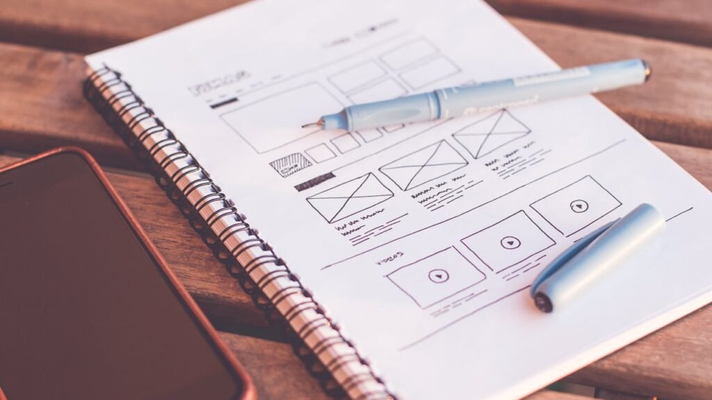
Practical Steps to Achieving a Simple Design
Start with a Plan
At the beginning of every design project, make a list of what you want to include in your website. Then, carefully personalize this list. Only include elements that help the user achieve their goals. Use white space. White space, i.e. negative space, should be your best friend. You don’t need to fill every pixel.
Strategic white space highlights important elements and gives the user’s eyes a rest. Select colors carefully. Your colors should support your brand and the readability should be perfect.
There should be good contrast between the text and the background. Creativity can be achieved through color combinations and integration, but if the content is not readable. The purpose of the website is also failed.
Fewer things in web design are more impactful when you adopt a simple city. Only then will your design become clear, user-friendly, and effective.
Creating Effective Visuals
Guide the user through your content
Visuals decide in what order the user sees the information on your website. If there is no clear hierarchy, the user becomes confused and does not understand what is important or what to do next. Think of visuals as a conversation.
First tell the important thing and then go to the details. Size, i.e. the size of the elements, is the first tool for creating hierarchy and it is also quite effective. Large elements naturally grab attention before small elements, but size alone does not work.
Color contrast, typography, font style and positioning are also important. To guide the user’s attention, it is necessary to establish a focal point on each page.
This focal point tells the user where the most important information is. On the home page, this can be your main message. Or it could be a purchase button on a product page. In a block post, the title and first paragraph can be important. Advanced drawer techniques can be a bit more advanced.
Balance also plays a very important role. Good balance creates a natural and comfortable atmosphere. Every element on the page is made with a good balance and no area overpowers. Balance can be achieved in two ways: Symmetrical, when both sides are the same element. Metrical, when there are separate elements but their visual weight is equal.
Symmetrical balance usually looks more dynamic and interesting.
For example, you can put a large image on one side and headings and paragraphs on the other side. The point is that both sides look equally important, even if the elements are separate.
Contrast also helps create atmosphere. High contrast between text and background improves readability. Contrast of elements size, color or style is important info.
But if there is contrast everywhere in the design, it becomes visual noise and the purpose of the heat is defeated, so balance and simplicity are important.
Navigation design that really works is the basis of user experience
Navigation is a roadmap of your website that helps visitors easily find the content they need without feeling confused or overwhelmed. If the navigation is weak, visitors will quickly abandon the site and move on to another website.
Effective navigation should be simple to understand and consistent on every page. Users should not have to think about how to move around the site.
The path should always be clear. This means using design patterns and elements that they already know from other websites. The location of navigation is just as important as its content.
Most people expect the main navigation to be at the top of the website, either in a horizontal link list or via a hamburger menu. Placing your navigation in a unique place can be creative, but it can also confuse the user.
Scalable Designing Navigation
As your website grows, your navigation also needs to grow. You can use drop-down menus to group related pages within a category without becoming cluttered or confusing. But they should be kept limited. Too many drop-down levels confuse users and make it difficult to understand the structure of the site.
If your website has a lot of content, a search function may be necessary. The search bar allows users to quickly find specific information, especially when they know exactly what they want. But remember, search integration is not a replacement, it should only support it.
Breadcrumb navigation is also very helpful, especially when the user is on a deep page. It shows how the user got from the home page to the current page, making it easier to navigate back to it or understand the site structure.
The Crucial Role of Content in Website Design
Content and Design are a Strong Relationship
Many beginners consider content as just an extra thing that needs to be added after the design, but this approach is wrong. Effective web design and effective powerful content work like a team. Both support each other and make each other better.
Your design should be such that it allows the content to shine and the content should explain the design discussion.
Good content brings people to your website and motivates them to take action. But if the design is bad, even the best content can fail. Tabography, font spacing, color and layout all decide how the user perceives and uses your content.
Before finalizing the design, think about how your content will look and work on different devices. Text that looks perfect on desktop may not work on mobile. It may be readable if you have not planned for small screens. Similarly, interactive elements should work smoothly on touch screens, not just mouse clicks.
Optimize content based on user behavior
Most users do not read the entire content. They just scan it. Therefore, your content should be in a format that supports scanning behavior. Use headings and subheadings to break up long paragraphs and highlight important points. Information is easily digested through bullet points and numbered lists.
Users have an F-shaped reading pattern, so this means that their focus is on the top and left side. Therefore, the most important information should always be at the top, on the left side of the content, and at the start of the paragraph. Place secondary information where it gets less attention. Images and visuals should support your content, not completely.
Each image should have a clear purpose. Whether you are explaining a concept or breaking down a text, making motivational connections, images that are just for decoration and serve no purpose, only divert attention and detract from the main message, so be careful of this.
Responsive design and mobile optimization are essential for designing for every device
Responsive design means that your website works perfectly on every screen size, whether it is a large desktop monitor or a small smart screen. In today’s time, it is not a luxury but a must. It is a feature that your users can access your website from anywhere, so the design should be accessible from everywhere.
Mobile usage is changing every year. Today, many websites get more traffic from mobile devices than desktop. If your website does not work properly on mobile, you lose more than half of your users.
Therefore, responsive design is not just a technical thing, it has become a business requirement. Responsive design affects every part. Navigation, layout, images, buttons, interactive elements, everything that is easily clicked with a mouse can be too small to tap with a finger on mobile.
Text that is readable on a desktop is too small or too large on mobile. It may seem like a smart way to implement responsive design. When starting with responsive design, adopt a mobile-first approach. Design for a small screen first, then plan for a larger version. This ensures that your core content and features work best on mobile and are easy to enhance for desktop later.
Mobile devices have a touch-centric interface, so mouse-based design rules don’t work here. Buttons and links should be large enough to be tapped easily, with enough space between them to prevent accidental button presses. The ideal touch target size is at least 44 pixels, but a little larger can be even better. Loading speed is also very important on mobile devices.
Sometimes users are using slow internet, so optimize images for each screen size. Remove unnecessary code for each screen size. The most important content should load first. Fast experience for users on mobile. They expect that if a website takes a long time to load, they will abandon it, which has a direct impact on your conversion rate.
Color Psychology and Brand Consistency
Emotional Impact of Color
Colors are not just visual elements, they trigger emotions and leave a powerful impression on the user. Different colors give different feelings, for example, blue shows trust and readability, red creates excitement or excitement. If you choose colors by understanding these associations, you can make your brand message strong.
But remember, color psychology is not universal. Different colors are perceived differently in different ways in every culture, based on personal experience and context. So don’t rely on general rules only.
Choose colors by understanding the emotions of your specific audience and industry. And yes, accessibility is also very important. Your color choices should not only be beautiful but also readable, especially for users with common impairments.
There should be a good contrast between the text and the background so that everyone can read it easily. For example, white text on yellow is not readable, similarly, black on red is not. In many countries, there are legal requirements for web accessibility, so it is not only ethical but also practical.
Create a strong and consistent color system
Create a limited color palette for your website to make it look clear and professional. A good palette consists of one primary brand color, one or two secondary colors, neutral colors such as white, gray, black for background and text.
When the palette is limited, use the color strategically or just for decoration. See how your chosen colors look with each other. Primary colors should be such that they work in both background and accent. Secondary colors should support the primary color and not complement it.
Natural neutral colors are good for contrast so that the text is readable and in harmony with the brand color. And most importantly, test your colors on real devices. A color that appears on a design monitor paper effect may appear dull or brighter on another screen.
Lighting conditions can also change color perception. Similarly, you should review your website on different devices and in different environments before launching.
Best Practices for Typography and Readability
Choose fonts that make the message clear
Typography means that your brand’s visual voice is not just text, but also expresses your personality and professionalism. Your content choice makes the user’s first impression.
Without context, script fonts give a sense of elegance or creativity. Saint-Séries fonts look modern and clean, but legibility is most important when choosing a font, especially for body text.
When fonts are difficult to read, use them only as headings or highlights. People come to your website to work, not to admire fonts. Today, web fonts have increased design options, but other fonts do not look good on every device and browser. Use fonts that look consistent on every platform.
Popular services like Google Fonts offer safe and label options. Do not use fonts from any third party. There may be a licensing issue.
How to create a readable text layout
Line height plays a big role in readability. The best practice is to have 50 to 75 characters in each line. If the line is too short, the reading becomes choppy and if the line is too long, it becomes difficult for the eyes to keep track of the next line.
Line spacing, i.e. reading quality, is also important. There should be enough space between the lines. The font size is one point four to one.6 times, but this can vary depending on your typeface and design context.
How to make a readable text layout
Line length plays a big role in readability. Best practice is to have 50-75 characters in each line of body text. If the line is too short, reading feels choppy. And if the line is too long, it becomes difficult to keep track of the eyes on the next line.
Line spacing i.e. leading is also equally important. There should be enough space between the lines so that the text looks readable, but the paragraphs do not look disconnected from each other. The general rule is: line spacing = 1.4 to 1.6 times the font size – but this can vary according to your typeface and design context.
The contrast between text and background impacts both readability and comfort. High contrast text is easily readable – especially for visually impaired users. But too much contrast can also cause eye strain – especially when the user reads for long periods of time.
User Experience and Usability Principles
Designing for Human Behavior
User experience is how people interact with your website – everything from their first impression to their last action. A good user experience is when everything feels smooth – without having to think about the interface or get confused.
Usability testing shows how real users are interacting with your design. Sometimes even small testing can reveal problems that you would not have realized when designing.
Testing with even a few users can provide valuable feedback that lets you know where the design is confusing.
Consistency in interface elements is very important. When buttons, links, and other interactive parts work predictably, users do not take much time to understand and they do their work easily. This consistency should also be there in visual design, interaction patterns, and content organization.
Common Usability Mistakes to Avoid
Auto-playing videos or audio can irritate people, especially when they are browsing in silence or on mobile data. If you want to show video, give the user control as to when they want to see it.
Pop-ups and interstitials that appear as soon as the website opens give a negative impression. If necessary, delay them a bit so that the user can see the content first.
Broken links and error pages break the user’s trust. Check every link from time to time and create helpful 404 pages that take the user back to the content, rather than leaving them at a dead end.
Performance Optimization and Loading Speed
Speed has now become even more important
Website speed directly affects user experience, Google ranking and conversion rate. If the website takes too much time to load, people leave it. Google also gives preference to fast websites.
Mobile users often have slow internet, so speed becomes even more important for them. The techniques that improve mobile speed are also useful on desktop.
Image optimization is the most impactful technique. Large and unoptimized images slow down the website, especially on mobile. Use the right format, compress and use responsive images that resize according to the device.
Technical Strategies for Better Performance
Reduce HTTP requests – combine files and remove unnecessary elements. Every file is an extra request sent to the server, the lesser the better.
Choose reliable web hosting – you will save money by using cheap hosting but if the website is slow then visitors will leave.
Use CDNs (Content Delivery Networks) – These serve the website from the server closest to the user, which increases speed, especially when the user is far from your main server.
Accessibility and Inclusive Design
Design for everyone
Web accessibility means that people with disabilities can also use your website easily. It is not just for them – it is helpful for everyone, such as clear navigation, readable text, etc.
Many countries also have legal requirements for accessibility. This also avoids legal problems and shows that you value every user.
It is important to add alt text to images – so that screen readers can understand what is in the image. If the image is just for decoration, then leave its alt text blank.
How to implement Accessible Design
Ensure keyboard navigation – so that the user can navigate without using a mouse. Whatever element is in focus, it should have a visual indicator.
Color should not be the only signal – for example, if you want to show an error, do not use only red, icons or text should also be shown.
Headings should have a proper hierarchy – so that it is easy for screen readers to understand the content. This is also good for SEO.
Testing and Improvement
Getting feedback from real users is a must
No matter how much you plan, real users always discover something new. Testing gives you problems and opportunities that you didn’t see while designing.
In A/B testing, you test different versions – like button color, heading text, layout – to understand what works best.
Analytics tools show you user behavior – like heat maps or user recordings. This helps to understand where the user is clicking or getting stuck.
Create a culture of continuous improvement
Web design is never finished – user needs, technology and business goals change over time. So make continuous improvements instead of redesigning every time.
Document what works – save successful designs, feedback and testing results to help in the future.
Don’t follow new trends and technology – evaluate based on user needs. The best design is the one that works for the user, not just the one that looks good.
Build Trust with Professional Design
Visuals build trust
Professional design wins the trust of the user in the first impression itself. Clean layout, consistent branding and attention to small details – all this shows that you are genuine.
It is important to maintain consistency on all platforms – be it website, social media or email. This builds brand recognition.
Contact information and business details should be visible – so that users feel that this is a real business, behind which there are real people.
Win user’s trust with technical reliability
There should be SSL certificate and secure connection. If the browser shows insecure then the user leaves the site immediately.
Functional errors (like broken links, forms not working) damage trust. Test everything.
Fresh content and regular updates show that the business is active. Old dates and dead links make the website look outdated.
How to avoid design mistakes and make your website look professional
We have discussed the design principles, now we will talk about how you can solve your design mistakes. For this, you will have to follow some rules, which we will now discuss in detail.
Rule No. 1: Keep Design Simple
Rule number one is good design is as little design as possible, that is, keep the design as simple as possible, focus only on the important things, make them better, and do not add unnecessary color, text, or elements. Many people make the mistake of first focusing on the header layout or buttons while designing, which blocks creativity. Instead, think first about what the main feature of the website.
Maybe just one heading, one input box, and one button. Start with that. Clear and simple design is the most effective. Users’ minds naturally focus on simple things. If your design is too complex, the user may get irritated. A design that is too full is not right. You have to keep the design simple. This will give your design a professional look and User experience will also improve.
Rule No. 2: Use Similarity and Proximity
Use the rule number two similarity and proximity, that is, explain through similar shapes, sizes, colors, and spacing which things are in the group. According to the guest start theory, humans first see overall patterns, then details. Therefore, make the design in such a way that it can be understood at a glance. The design should be scannable, in which the user can immediately understand what is important. Similarly, with similarity, the design will look consistent, and with proximity, the layout will look clear.
Rule No. 3: Proper Spacing
Spacing should always be more than you think. When you are working on an element, it may seem like the spacing is more, but when the user sees the entire screen, proper spacing is important. So, first give more spacing, then gradually reduce it until it looks perfect.
Rule No. 4: Use a Design System
Use a design system. This is especially important for large websites. Keep a basic system for small sites as well, such as spacing multiples of four, such as eight pixels, 16-pixel font size, and color palette. Use REM units. For responsive design, calculate 16 pixels as a RAM. Choose a single font. Fix four to five font sizes and use only three or four colors, one dark, one light, and two accent colors.
Everything should be readable. Do not center align small text or paragraph text. Remember, the smaller the font size, the higher the line height should be. Therefore, readability is better. Vertical spacing is also adjusted by line height.
There is no need to add spacing separately. After fixing fonts and colors, first set the design of buttons and links. Create a consistent style for primary and secondary buttons. Now that the system is set, start the actual design. Web design means putting the right elements in the right place, keeping in size.
Rule No. 5: Hierarchy Matters
Decide what the user should pay attention to first. The title is the main focus, so keep it big and bold. If both the title and secondary text are in high contrast, reduce the contrast of the secondary text. If it still doesn’t reduce, increase the size or weight of the title. Zoom out and see if the title is the first to be seen or not. The goal is to make the design scannable. If it is not, adjust the font size, contrast or spacing.
It is not necessary to make every H1 tag big. Sometimes, H3 or paragraphs also need to be highlighted. Highlight what is important. Keep everything else subtle. If you design too much, the design becomes messy. But if you want to show a little personality, you can use drop shadows, gradients and depth. Shadows make elements pop out and gradients bring life to the design. Make lists and tables attractive too, and if the layout is If you feel like blending, use cards,
Creativity and Inspiration in Web Design
Remember where all these ideas come from, creativity is a process. First learn the basics like these rules. Read design books, learn online tips, watch videos on YouTube, then find inspiration. Analyze the Figma community or best websites.
See what you liked in each section and why. What attracted you first? Why did they add this thing here? Understand these things. When you focus on these things, your creativity will increase. Were there photos in the testimonials? Was the language used? Note down such ideas that will boost your creativity further. Then take a break.
Don’t start direct design. Give your brain time to process those ideas. When you come back to work after the break, you will get new ideas. Similarly, if you can create a separate design in your mind by mixing several websites, then your creativity will boost.
If you don’t get it, then maybe you need a rest. A tired mind is not creative. And when you make a design, don’t love it. Get feedback from friends, team members or users. If possible, your best design should be in the third or fourth try. Just finish the design. Stop thinking. Take action. It doesn’t matter if the design is good or bad.
It is important to remember that you worked hard. This also boosts your creativity and you will know what mistakes you made and you can give your best next time. All you have to focus on is that at least your design is complete. Creativity comes from a mindset, not from magic.